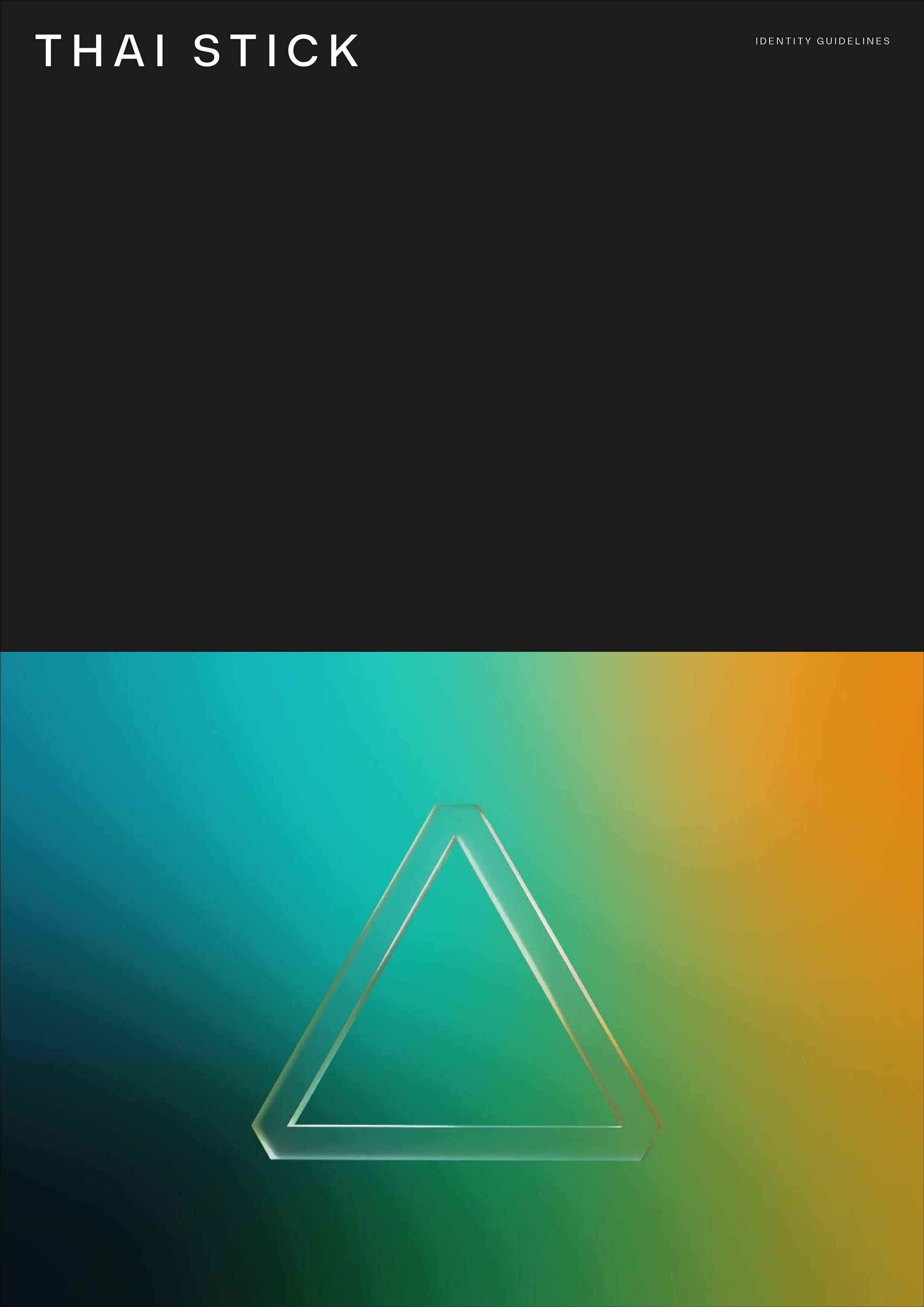
Thai Stick
Brand identity for a new cannabis cultivation venture
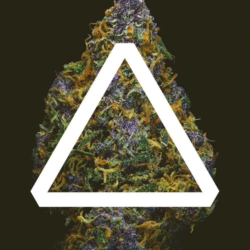
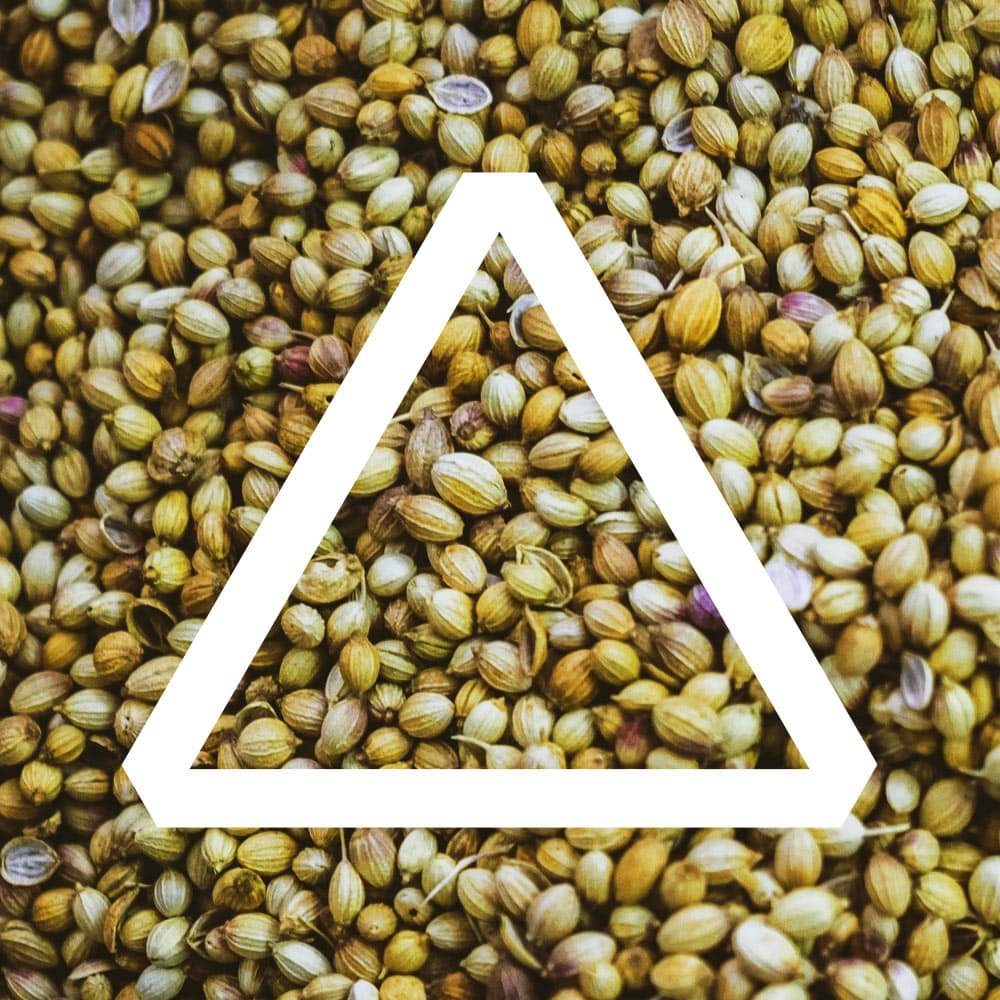
Avoiding the stereotype image of the cannabis leaf, we proposed a creative concept based on the idea of triangulation in sacred geometry to mirror the three founders as well as the three brand pillars – cultivation, wellness and distribution.
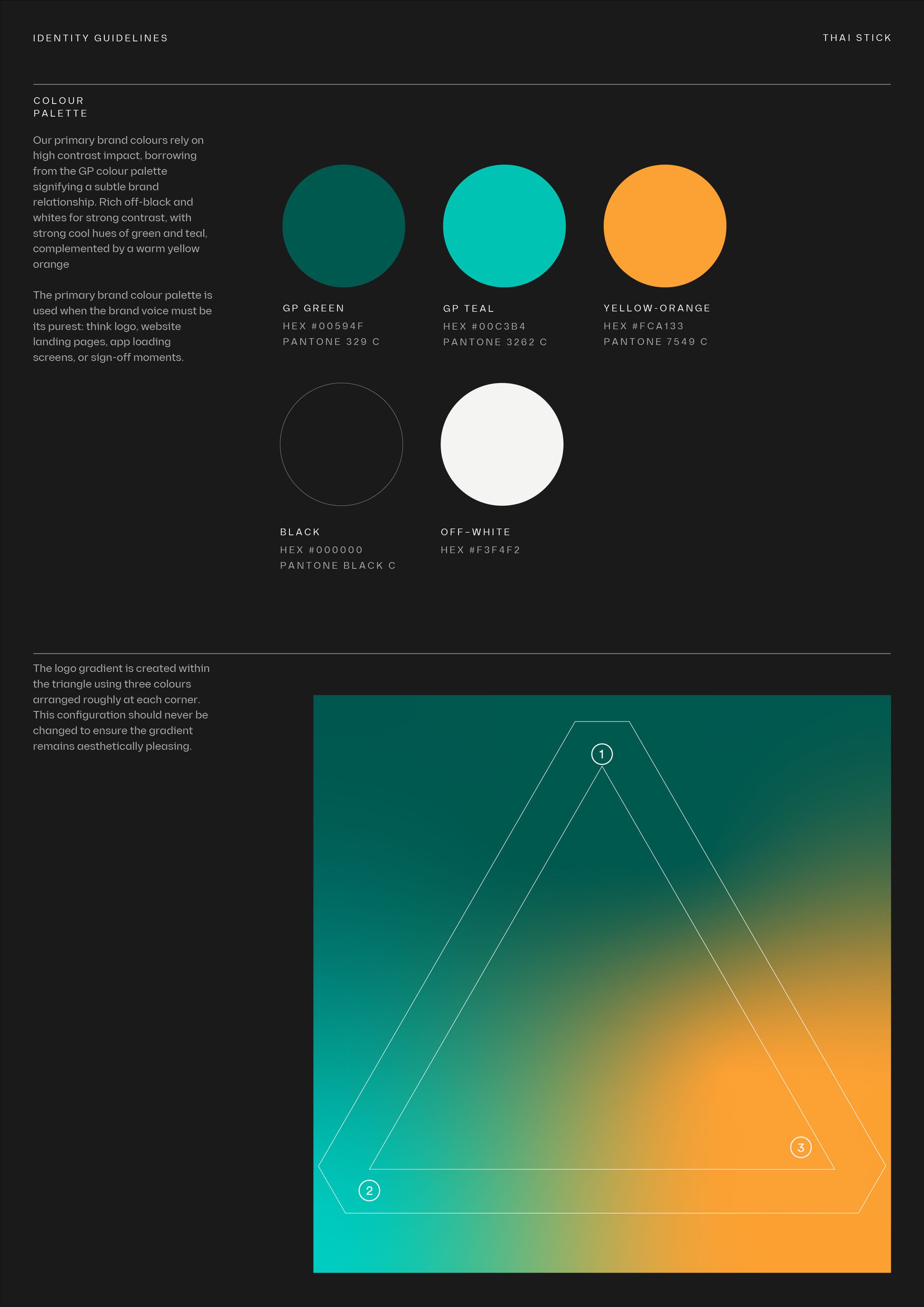
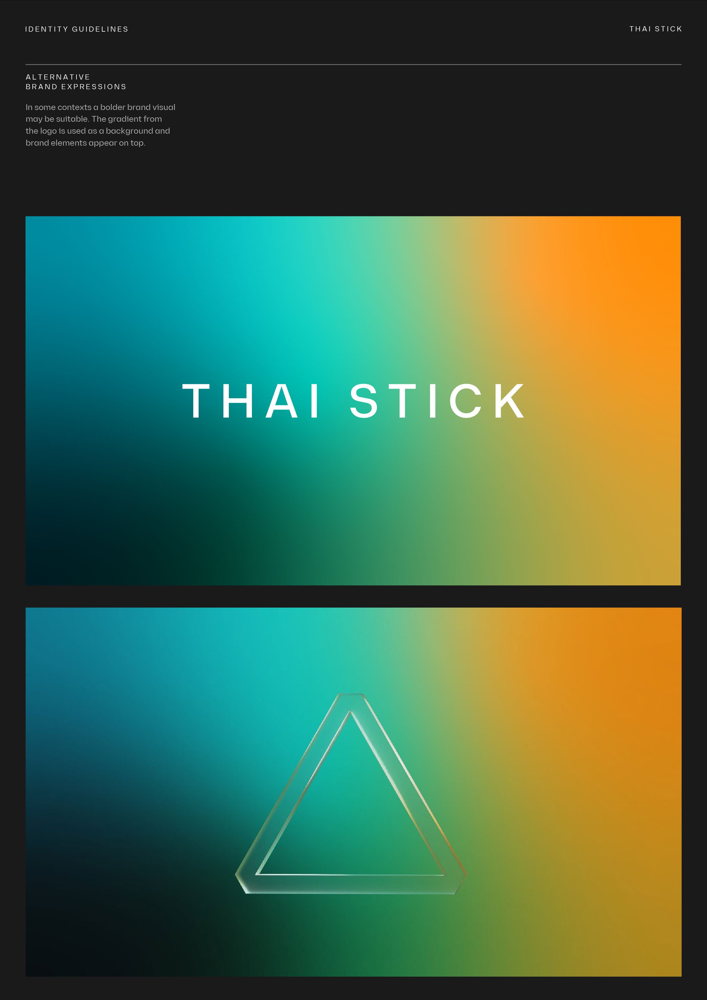

The Thai Stick brand colour palette includes greens from the Thai Indian parent company. The gradient is sometimes shown through the lens of a glass triangle which refers to the three brand pillars – Cultivation, Wellness and Distribution.


The triangle is designed to be a recognisable symbol even when used in applications without the name, on promotional material or merchandise.