Wongnai
Brand evolution for Thailand’s leading social review platform

Wongnai approached Mandala Studio for a refresh of their existing brand to create something more versatile to meet future business goals. The outcome of that collaboration was a stripped back, bolder identity, symbolising the power of reviews.

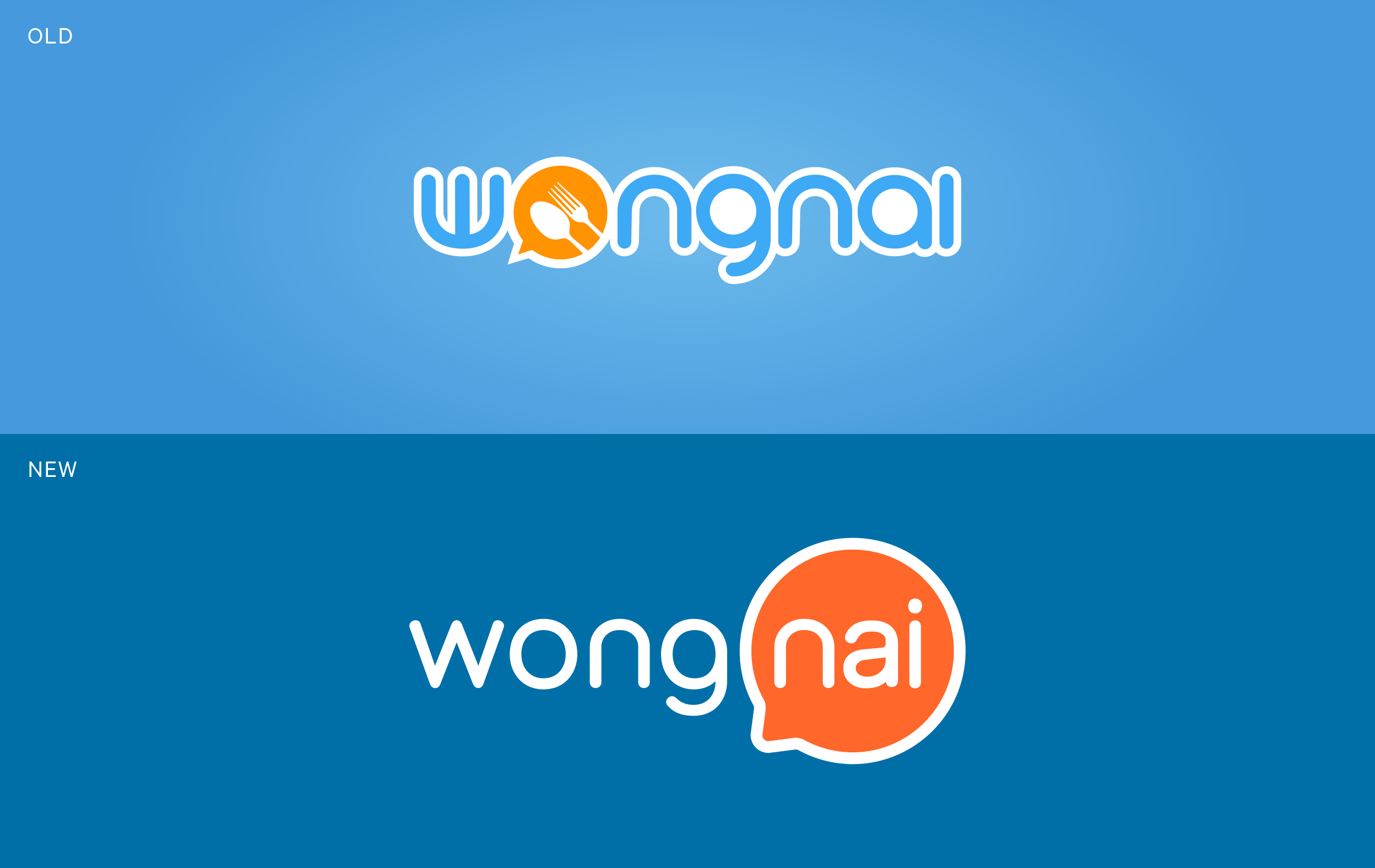
Wongnai required an identity refresh that would move the brand forward into lifestyle. However we could not risk a completely new image that would confuse users.
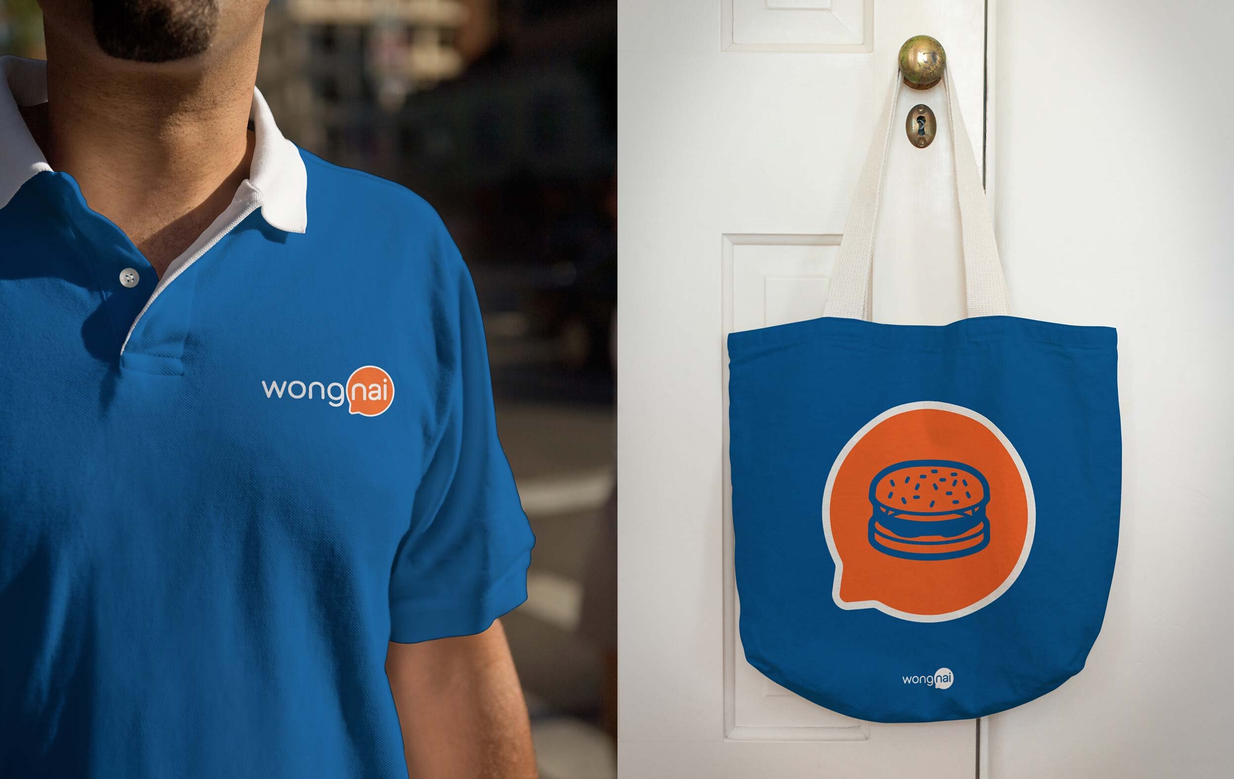
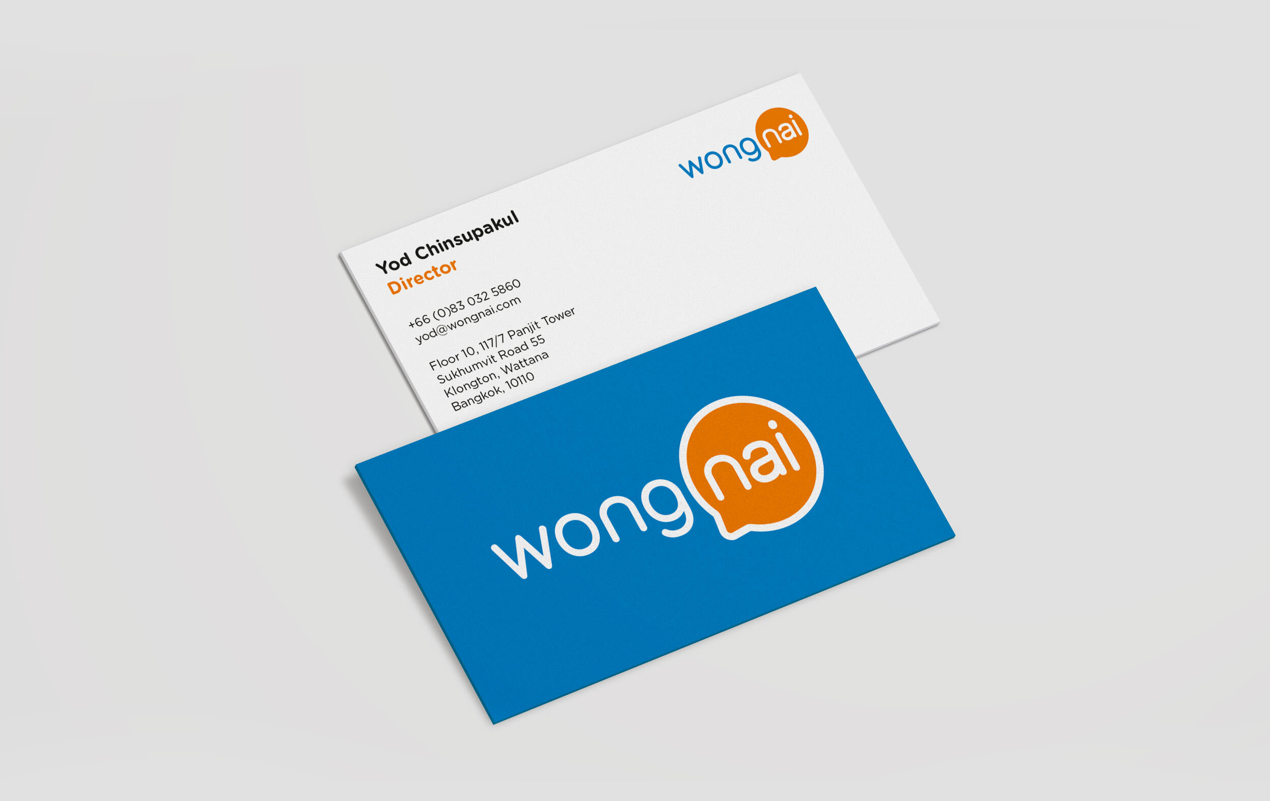
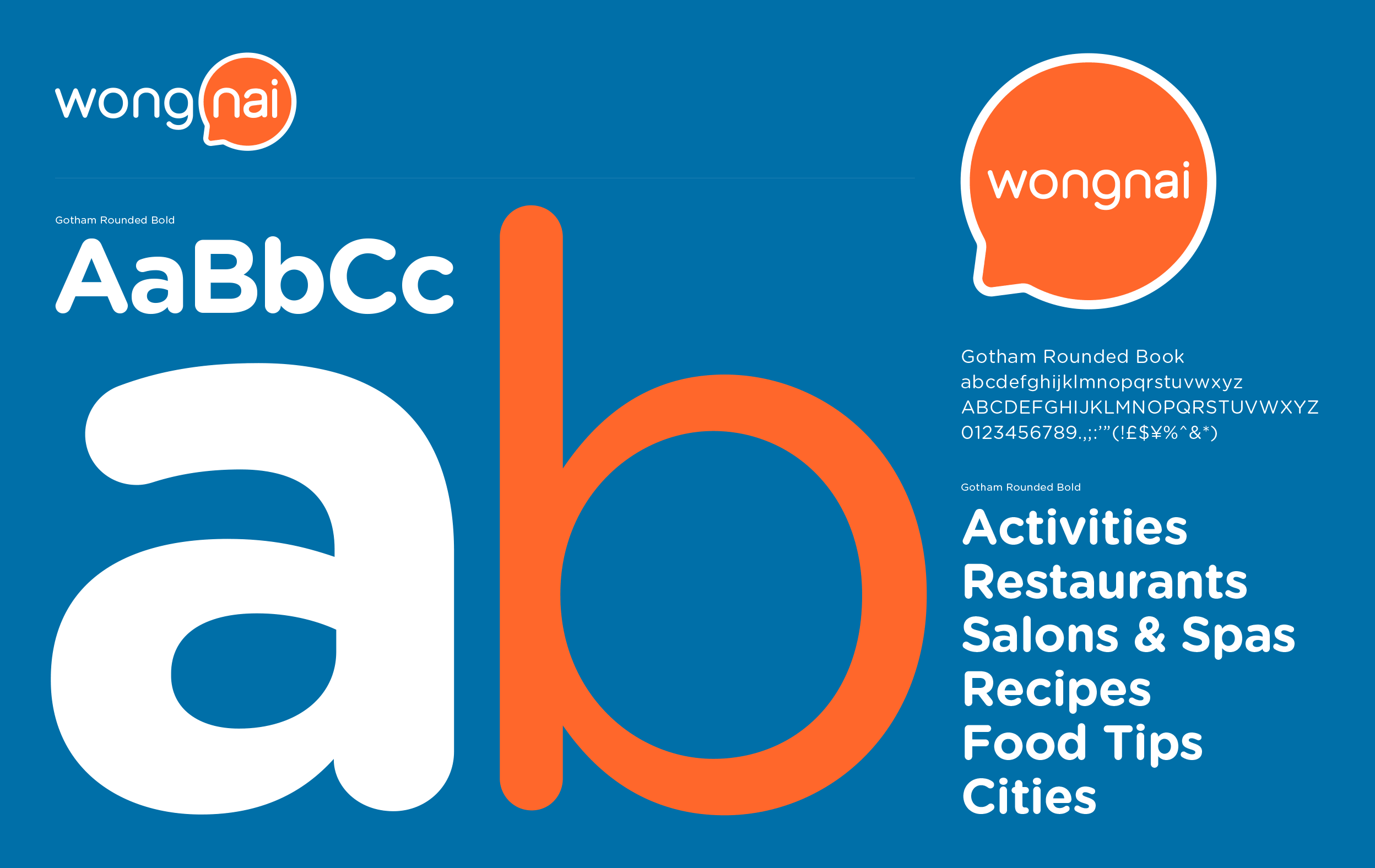
Our brand strategy built on the brand’s existing recognition and the continuity of brand elements, to redefine Wongnai using community, locations and reviews whilst shifting away from the specific theme of food. The final identity does away with the cutlery and boldly uses the speech bubble to symbolise the power of reviews. An audit of the old logo revealed that users recognised Wongnai for it’s colours, so it was important to keep them.

The Wongnai identity is much more relevant to the company’s expanding business needs. Shortly after the brand refresh Wongnai went on to secure Series B funding from InVent.

“Mandala Studio proposed the design approach they would take. They broke the requirements down so it was easy to understand and decide for us. The design is more modern and more flexible. We immediately deployed it to our website and app. So far it's been great."
—Yod Chinsupakul, Wongnai CEO & Co-founder